

Color palette
Our color palette is designed to build on our primary UAF blue and gold. This set of options offers the versatility needed to keep communications looking fresh and dynamic.
Primary and secondary color palettes
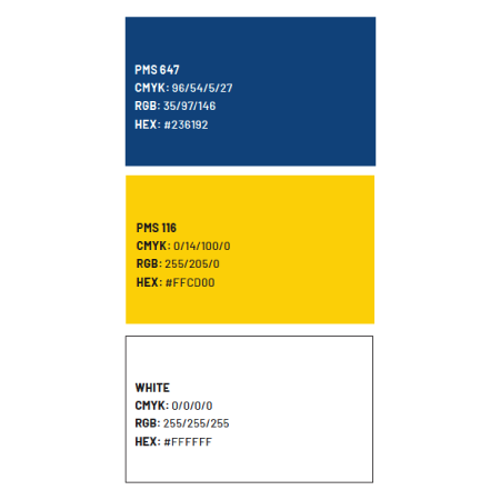
These are our core colors. They identify our university and should be the most prominent colors in any piece.
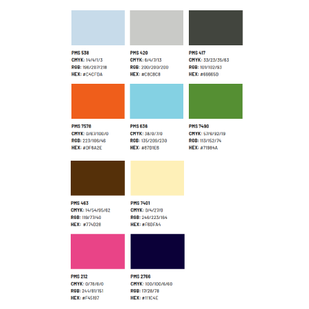
These colors build variety and dimension into our layouts. The secondary palette can be applied as a bright pop of color or provide contrast. See color ratios on page 48 for guidance on applying our secondary palette.
How to use the color palettes
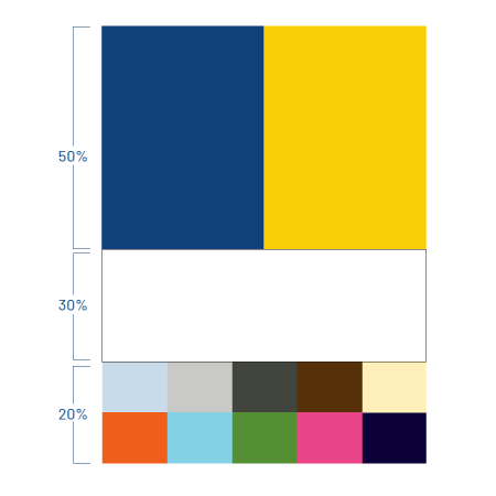
Our primary blue and gold should be predominant in most layouts. Never use secondary colors in this way. By leading with our primary colors, we can celebrate the pride we have in our institution and incorporate a thoughtful amount of negative space. Rather than viewing open space as a blank area, think of it as a pause. Whether it’s in a photo or a layout, don’t rush to fill every area on the page. What’s absent can focus attention on the content that’s there. Ratios on individual pages, spreads, layouts and even full communications can vary. The important thing to remember is that our primary colors should be the predominant colors overall. When viewing all the pieces the university creates and applying the “squint test” to the brand as a whole, the balance of color should feel close to what’s shown here.
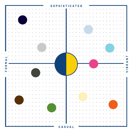
This chart is a guide for the mood, feelings and overall tone of our communications. Our colors range from sophisticated to casual and from formal to vibrant. Use this diagram as a starting point for choosing a palette that projects the right mood for your piece.
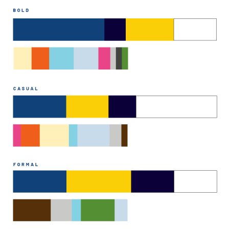
The following examples break down the secondary color palette to show how color combinations can be used successfully. Each set is different, but these still should be used in extremely limited instances, in the ways already described in this document. The primary colors should always remain predominant.
Downloads