
Typography
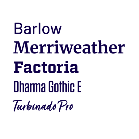
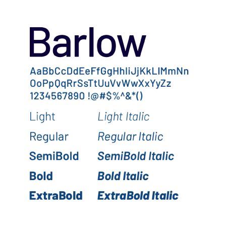
Barlow is a slightly rounded, grotesk type family. Crafted with legibility at the forefront and drawing on the design of public signage, this typeface shares qualities with license plates, highway signs, buses and trains.
Barlow is one of our primary body copy typefaces and is recommended as the primary typeface for websites and screens.
Licensing
Barlow is an open-source font and is available for free from Google Fonts.

Merriweather is a serif font family available in several weights. Designed to be pleasant to read with a very large x-height and open forms, this typeface is good for setting larger blocks of text.
Merriweather is one of our primary body copy typefaces.
Licensing
Merriweather is an open-source font and is available for free from Google Fonts.
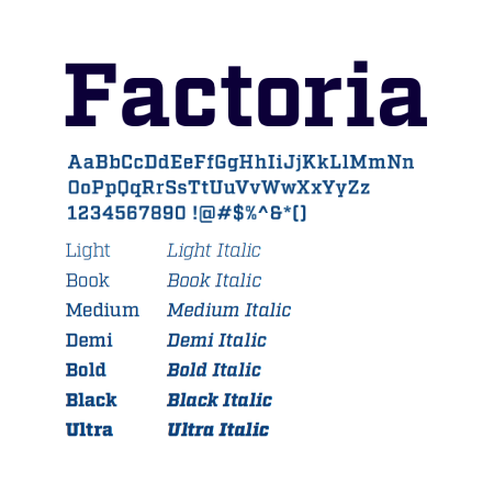
Factoria is a geometric, square slab face. The lighter versions can evoke a clean and modern character, while the thicker versions exude strength and grit. Factoria is available in a variety of weights ranging from Thin to Ultra, but the heavier weights are preferred for their more substantial appearance.
Factoria is good for headlines, subheads and callouts.
Licensing
Factoria is available within Adobe Fonts through a Creative Cloud subscription or for purchase from www.fortfoundry.com. If you cannot obtain a license for Factoria, or for use on the web, Zilla Slab is available as an alternative from Google Fonts.
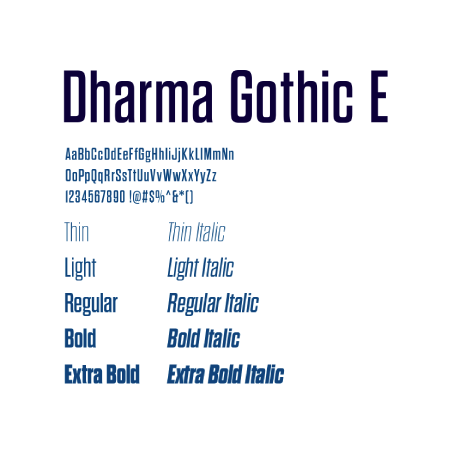
Dharma Gothic E is a nostalgic, antiqued sans-serif inspired by 1800s-style wood type. This condensed family comes in many styles, with a design that makes it a good solution anywhere you need impact.
Dharma Gothic E is good for headlines, subheads and callouts.
Licensing
Dharma Gothic E is available within Adobe Fonts through a Creative Cloud subscription or for purchase from www.dharmatype.com. If you cannot obtain a license for Dharma Gothic E, Saira Condensed is available as an alternative from Google Fonts.
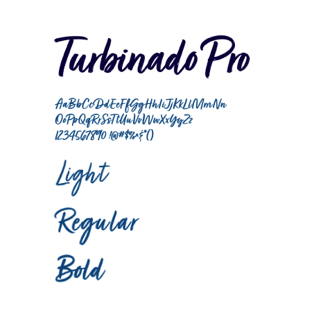
Turbinado Pro is a hand-lettered script family available in three weights. The hand-written quality of this typeface adds a personal and expressive touch to materials. This type can best accompany our primary typefaces as an embellishment.
Turbinado Pro is a decorative typeface that is used sparingly, for a more personal,
casual feel.
Licensing
Turbinado Pro is available within Adobe Fonts through a Creative Cloud subscription or for purchase from Fonts.com.
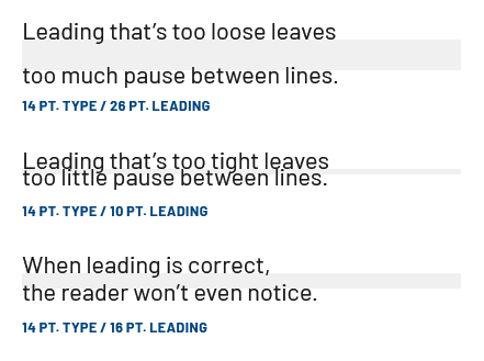
Line spacing, called leading, is critical to setting professional-looking type that’s easy to read. Leading should be set tight but not too tight. All our typefaces generally look best with leading set slightly looser than the default.
A good rule of thumb is to start with leading that’s two points higher than the point size of the text. This won’t always be right, but leading can be adjusted most easily from there.
Correct letterspacing, called tracking, also helps to make the type easy to read. Outside of headlines or text set in all caps, it’s usually acceptable to use the default tracking; however, you may need to increase tracking at small scales and decrease it at large scales. Some typefaces have optical adjustments built into the font files.
The term “tracking” refers to overall letterspacing for groups of letters and entire blocks of text. The term “kerning” refers to selective letterspacing between pairs of characters.
Our typefaces were selected to be mixed into dynamic, engaging headline constructions. See page 39 of the UAF Brand Guidelines PDF for examples when creating your own.