Logo and identity
Our logo is one of our most visible and valuable assets.
A strong visual identity contributes to our university’s reputation and brand; better enables us to recruit outstanding students, staff and faculty; and allows us to effectively engage alumni, donors and friends. Using consistent visual elements in our communications builds recognition. Just as almost anyone can quickly identify a Starbucks coffee cup, so should friends and colleagues of UAF be able to tell at a glance that a T-shirt, brochure, poster or other item is from the University of Alaska Fairbanks.
The University of Alaska Fairbanks is the only entity with a stand-alone logo. Our signature system effectively links our campuses, schools, academic and research units, and administrative offices with the UAF brand. These units have individually designed signatures that feature their names in combination with the UAF symbol and wordmark. This system has one goal: to unify, promote and enhance the university’s reputation. Every member of our university community plays an important role in maintaining brand integrity by applying these guidelines consistently throughout all university communications, including print, web, display, broadcast and electronic pieces.
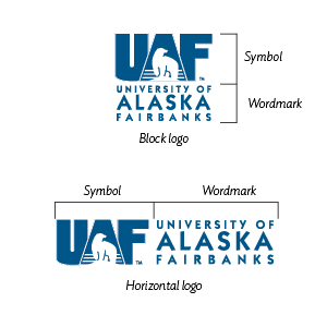
Our logo is composed of two parts: the symbol and the wordmark. The logo forms the foundation of a flexible system designed to help all of our communications pieces exist within the same family. All communications, both print and electronic, published by the University of Alaska Fairbanks must prominently display an approved logo. Here are some basic guidelines for using the logo:
- Treat the logo as artwork, not as typography. The logo should be treated as a graphic
icon.
- There are two variations of the UAF logo: the block version and the horizontal version.
This allows flexibility for different media and formats.
- To ensure recognition beyond Alaska, the UAF letters that make up the symbol must always be used with the words “University of Alaska Fairbanks.”
- The symbol may be used without the wordmark, provided that the full university name appears elsewhere on the page. The wordmark may not
be used without the symbol.
- The logo is most often used in blue or black and should only be used in official UAF primary colors or black. The bear should be white.
It’s important that the logo remain prominent and legible, so keep these parameters in mind when applying it to materials.

The logo should never feel like it’s crowded or competing for attention. To avoid
this, always allow ample clear space around it. This space is measured by the height
of the “A” in Alaska and extends around the entire perimeter of the logo.

Good practices to follow and pitfalls to avoid when using the logo.
DO use the logo straight and in its original proportions.

DO use official UAF primary colors or black.

DO put the logo on a solid color background to help it stand out.

DO make sure the logo is legible over a background image and the bear is white.

DON’T rotate, skew, distort or otherwise modify the logo.

DON’T fill the logo with any other colors or textures.

DON’T use extreme drop shadows or other visual effects.

DON’T place the logo on a background that makes it hard to read or changes the color of the bear from white or black.

There are other brand identifiers in the university system. Note that they have additional limitations or rules surrounding them.

UAF’s mascot is the Nanook, which is derived from the Inupiaq word for polar bear,
nanuq. The UAF Nanook bear is available as a trademarked graphic. The Nanook bear is the only stylized polar bear that should be used. Please
do not create animated, hand-drawn or other versions of a polar bear. This helps keep
our logo system and brand consistent. If you have any questions or need further guidance,
please reach out to University Relations at uaf-logo@alaska.edu.
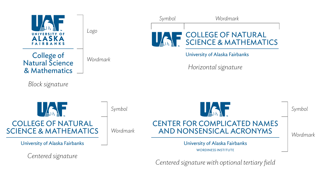
For the UAF brand to be known and recognized, we must present a unified visual identity. Use of the UAF logo is preferred for use on most publications and websites as it covers the entire university. However, recognizing that academic and administrative subunits may wish to emphasize their areas of focus, UAF has implemented a system of unique signatures based on the main UAF logo. The signatures have two parts: the UAF symbol or block logo, and a wordmark of the unit name. For centers and institutes that fall under the umbrella of a college or school, the secondary emphasis will be on UAF with the umbrella unit in a tertiary role.
University Relations will create packages of signatures for free upon request from schools, colleges or campus units. Complete the online art pack request form, and we'll create logo files that will work for both print and electronic products. Departments, programs, centers or other administrative units may not build their own signature logos.
General guidelines for using signatures
- Signatures are created as graphic elements. Do not attempt to re-create or modify them in any way.
- Signatures may be used in situations where the unit's identity is primary, such as on stationery and forms.
- Signatures always include the line "University of Alaska Fairbanks" to emphasize the relationship with UAF.
- A signature wordmark may not be used without the UAF symbol.
As part of the university's long-term effort to capitalize on its primary brand, new unique logos are not approved for any academic, administrative or research units. Secondary logos dilute the university brand and create confusion. Units that have an existing unique logo can retain their logo in its current form only. No alterations, changes or updates will be permitted. When those logos become outdated, units can adopt the university approved signature system. No new logos are permitted unless reviewed by the UAF Graphic Identity Committee and signed off by the chancellor. See Exemptions and special cases below for more information on requesting a special exemption to this rule.
Requests for exemptions from UAF graphic identity guidelines will be reviewed by the UAF Graphic Identity Committee, and exemptions approved by the chancellor sparingly. Any unit applying for an exemption must make a compelling argument that goes beyond funding sources. Before applying for an exemption, please consider the following questions:
- Does funding for your school/department/center/program come from UAF, an external agency or both?
- Which entity is better known: UAF or your school/department/center/program?
- Does using the UAF logo violate laws, contractual agreements or regulations imposed by an external agency?
- Does your school/department/center/program use UAF resources?
- How important is the UAF association to incoming students, funding agencies or your target audience?
- How similar are UAF and your school/department/program in personality and mission?
- Do you have adequate resources to market and promote your school/department/program on your own?
- Would using the UAF logo substantially hinder your communication goals?
If you believe your needs cannot be adequately represented by the UAF logo please fill out the exemption form, and the UAF Graphic Identity Committee will review your request. Please allow four weeks for review and a response.
If permission for the development of a separate graphic mark is approved, the design and use of the secondary mark will be developed in consultation with, and will be approved by, University Relations. Any future rebranding needs to be done in cooperation with UAF University Relations.
All marketing materials must be aligned with the university's primary logo and comply with its standards.
Questions? Please contact University Relations at uaf-logo@alaska.edu.
Other logo exceptions
Because of the breadth of life and work within the university, there are many other cases that require special consideration regarding the logo. These include:
- Anniversary celebrations for colleges, departments or other units
- Special events for fund-raising or recognition
- Affiliate organizations (e.g., UAF Alumni Association)
- Special affiliations for accreditation or funding purposes
It is not possible to cover all of these exceptions in this guide. The general rule is to follow the spirit of the guidelines whenever possible.
These logos must be used in accordance with UAF logo guidelines. Please review the logo usage guidelines above before downloading any files.
Print use
Logos are provided as EPS and PDF files for print in CMYK color profile with black
fill, blue fill, gold fill and white. See the official UAF colors for CMYK and Pantone PMS color specifications.
Web use
Logos are provided as SVG and PDF files for web in RGB color profile with black fill,
blue fill, gold fill and white.
UAF symbol
The symbol may be used without the wordmark, provided that the full university name appears elsewhere on the page. The wordmark may not
be used without the symbol.
Standing bear
UAF’s mascot is the Nanook, which is derived from the Inupiaq word for polar bear,
nanuq. The UAF Nanook bear is available as a trademarked graphic. The Nanook bear is the only stylized polar bear that should be used. Please
do not create animated, hand-drawn or other versions of a polar bear. This helps keep
our logo system and brand consistent. If you have any questions or need further guidance,
please reach out to University Relations at uaf-logo@alaska.edu.
Athletics mark
The A-bear trademark is primarily used by the UAF Athletic Department and its entities.
The walking bear image may not be used alone. Contact University Relations at uaf-logo@alaska.edu for additional guidance on using the athletic marks.
